Client
SquidFlow
Publish Date
September, 2024
Evolving the SquidFlow Identity
From a playful concept to a bold brand, then onto the web and beyond.
SquidFlow™ offers data analytics and machine learning solutions, turning complex datasets into actionable insights for smarter business decisions.
My role was to translate that technical expertise into a visual identity that’s both sharp and approachable—something that speaks to innovation and clarity.
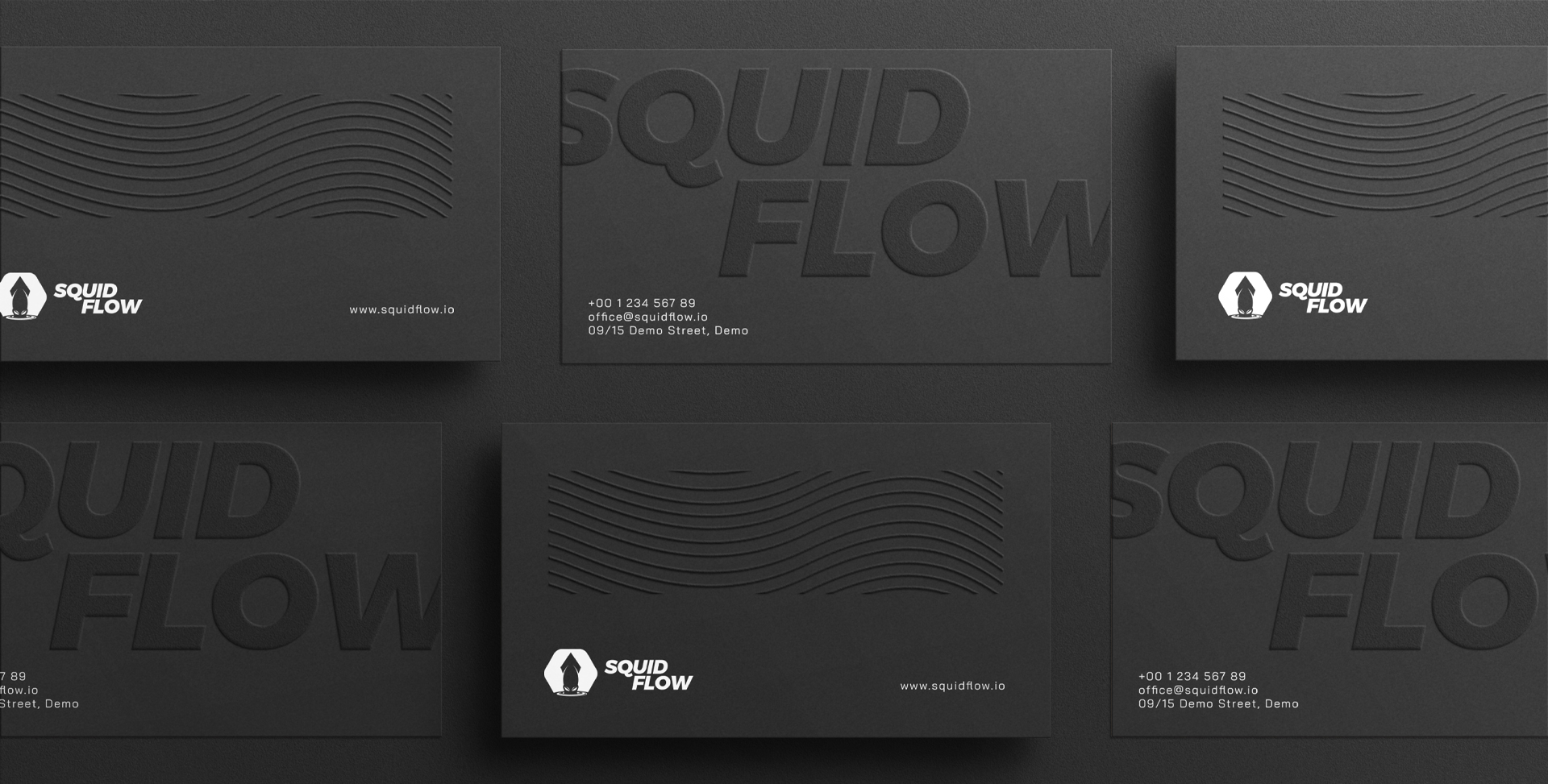
SquidFlow’s identity emerged from a journey of visual refinement. We started with a fun, comic-style logo over three design iterations, before landing on a more assertive, modern emblem that aligned better with their brand aspirations. Together, we defined a color palette, typography, and usage guidelines that lend the brand consistency and confidence across every touchpoint.

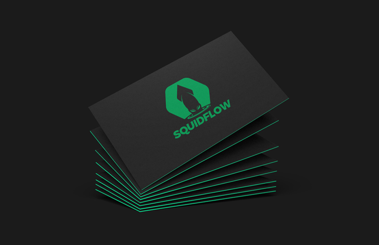
01. Logo Reinvention
I started by exploring over three distinct logo directions, from the client’s original kid-comic idea to a darker, edgier treatment that ultimately resonated more. Through multiple color palettes and typographic tweaks, we landed on a version that balances approachability with a hint of danger, perfectly capturing SquidFlow’s adventurous spirit.
02. Building the Brand Palette
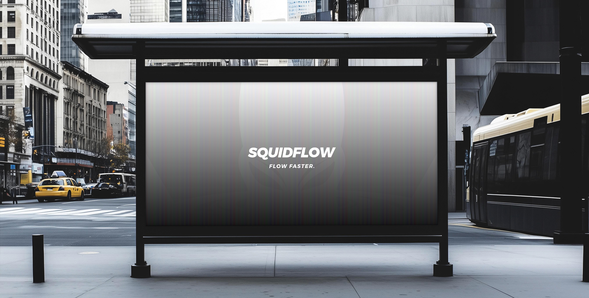
Once the logo was locked in, I established a cohesive visual system: primary and secondary colors, font families, and usage guidelines. This living style guide ensures every touchpoint, whether social media post or pitch deck, feels unmistakably SquidFlow.
03. Web & Platform Design
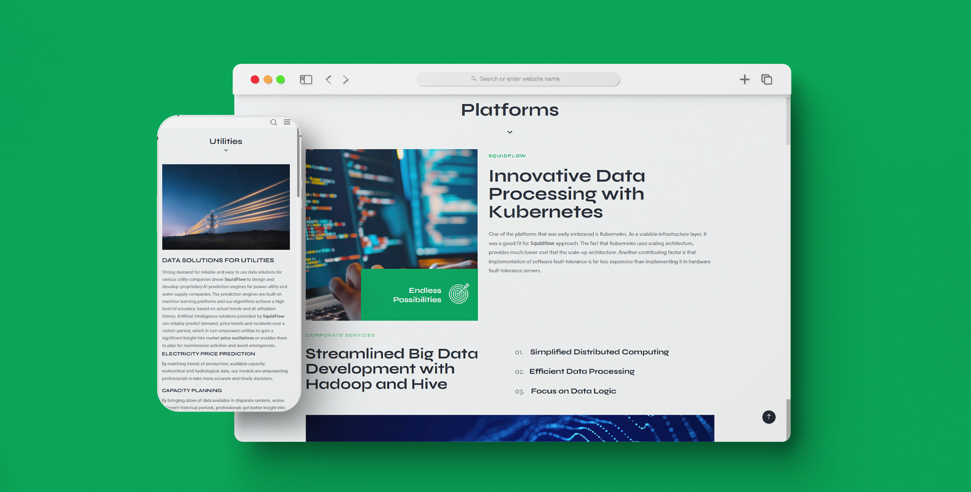
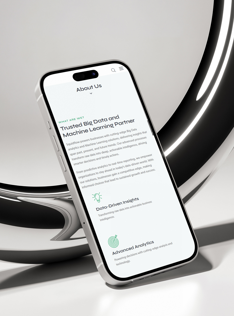
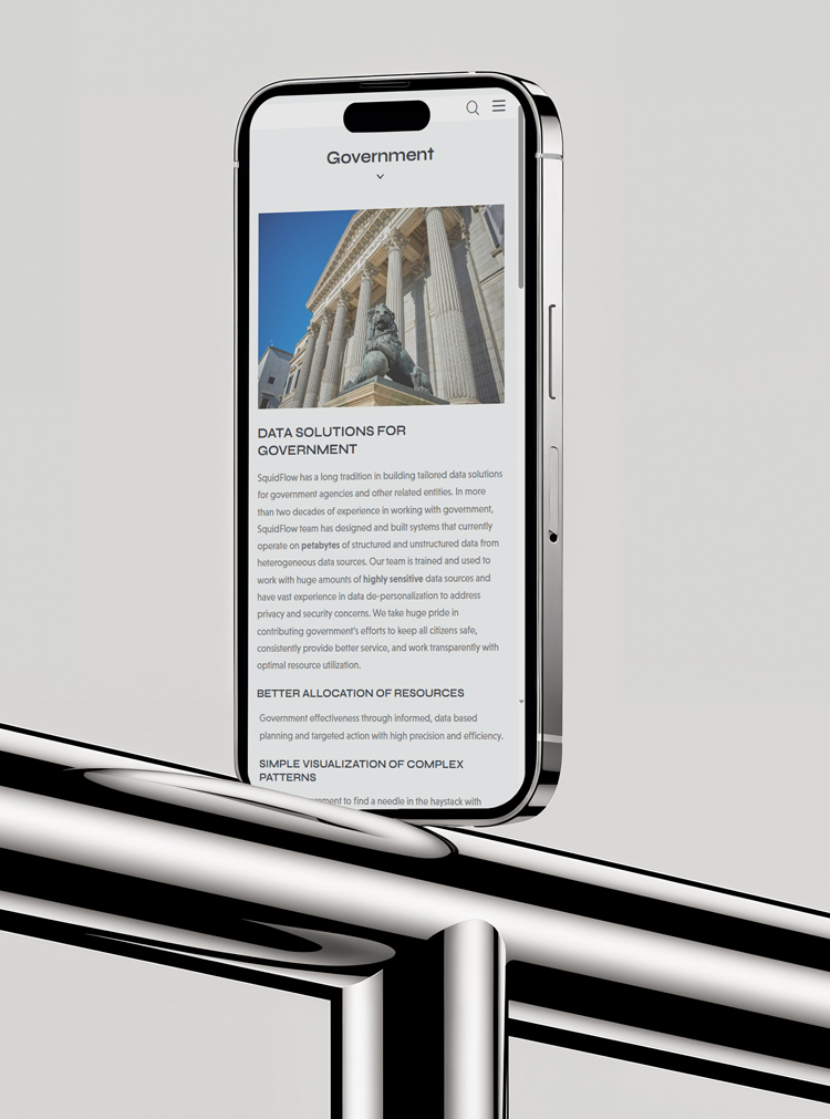
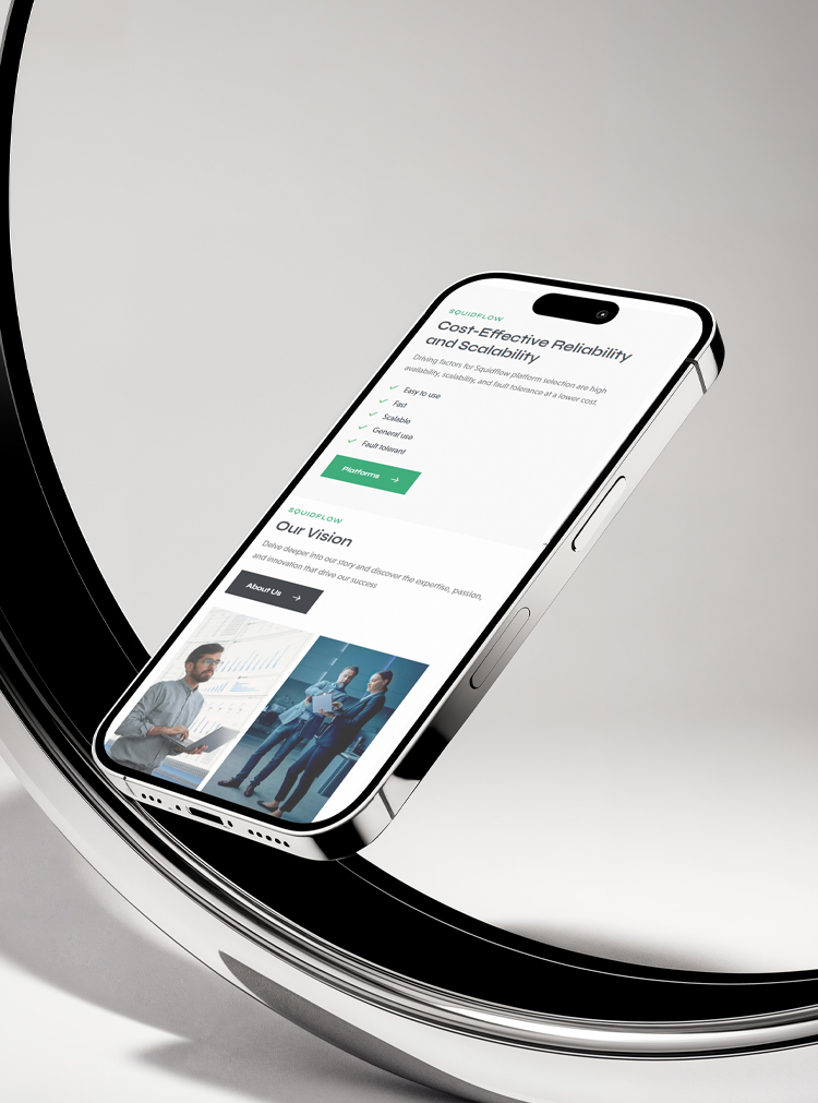
Next, I translated that identity into a sleek company website, focused on clarity and engagement. Now, I’m refining the UI/UX of their new client platform, streamlining workflows, improving navigation, and making sure every screen reflects the brand’s bold personality.
